dissmapr
A Novel Framework for Automated Compositional Dissimilarity and Biodiversity Turnover Analysis
1. Run clustering analyses using map_bioreg() to map
bioregions
In this step we translate our site‐level ζ₂ predictions into spatial
bioregions. Calling map_bioreg() on the predictors_df does
the following:
- z-scales the predicted turnover, longitude and latitude;
- fits four clustering algorithms (k-means, PAM, hierarchical and GMM);
- k-means partitions points around centroids and is fast for large data sets.
- PAM (Partitioning Around Medoids) is a medoid-based analogue of k-means that is more robust to outliers.
- Hierarchical agglomerative clustering builds a dendrogram and then “cuts” it at the chosen k, capturing nested structure in the data.
- GMM (Gaussian Mixture Model) treats clusters as multivariate normal distributions and assigns each point by maximum likelihood.
- realigns each method’s labels to the k-means solution for consistency;
- builds both nearest-neighbour and thin-plate-spline interpolated surfaces;
- returns the raw cluster assignments and gridded rasters, and—because
show_plot=TRUE—draws a 2×2 panel of maps.
The result is a set of complementary bioregion maps and rasters you can use to compare how different algorithms partition the landscape based on compositional turnover and geography.
# Add this to {, fig.width=11.25, fig.height=9, warning=FALSE, message=FALSE}
# Run `map_bioreg` function to generate and plot clusters
bioreg_current = map_bioreg(
  data = predictors_df,
  scale_cols = c("pred_zetaExp", "centroid_lon", "centroid_lat"),
  method = 'all', # Options: c("kmeans","pam","hclust","gmm","all"),
  k_override  = 8,
  interpolate = 'nn', # Options: c("none","nn","tps","all"),
  x_col ='centroid_lon',
  y_col ='centroid_lat',
  res = 0.5,
  crs = "EPSG:4326",
  plot = TRUE,
  bndy_fc = rsa)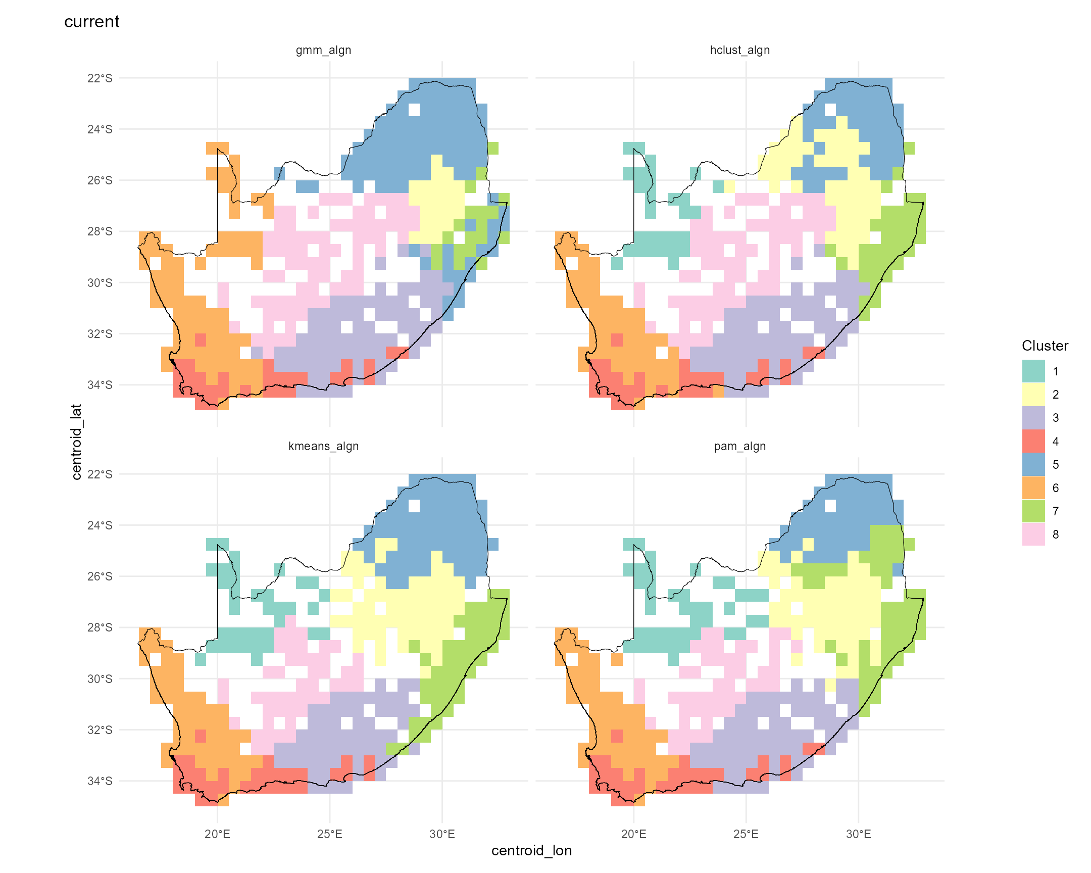
# Check results
str(bioreg_current, max.level=1)
#> List of 6
#>  $ none   :List of 1
#>  $ nn     :List of 1
#>  $ tps    : NULL
#>  $ table  :'data.frame': 415 obs. of  24 variables:
#>  $ plots  :List of 1
#>  $ methods: chr [1:4] "kmeans" "pam" "hclust" "gmm"
2. Map future bioregions using map_bioreg()
Below we expand our workflow to map the forecasted ζ₂ bioregions
under three extreme climate futures (2030, 2040, 2050) alongside the
current scenario. To see how the bioregional partitions shift, we split
all_preds by scenario and apply map_bioreg()
(k-means + hierarchical, both NN and TPS interpolation). We then extract
the hierarchical cluster layers, mask them to our study area, and plot
all four maps in a 2×2 layout:
# Split your combined predictions by scenario into a named list
by_scn = split(all_preds, all_preds$scenario)

# For each scenario, call map_bioreg() with all algorithms
bioreg_future = map_bioreg(
  data = by_scn,
  scale_cols = c("pred_zetaExp", "centroid_lon", "centroid_lat"),
  method = 'all', # Options: c("kmeans","pam","hclust","gmm","all"),
  k_override  = 8,
  interpolate = 'nn', # Options: c("none","nn","tps","all"),
  x_col ='centroid_lon',
  y_col ='centroid_lat',
  res = 0.5,
  crs = "EPSG:4326",
  plot = TRUE,
  bndy_fc = rsa)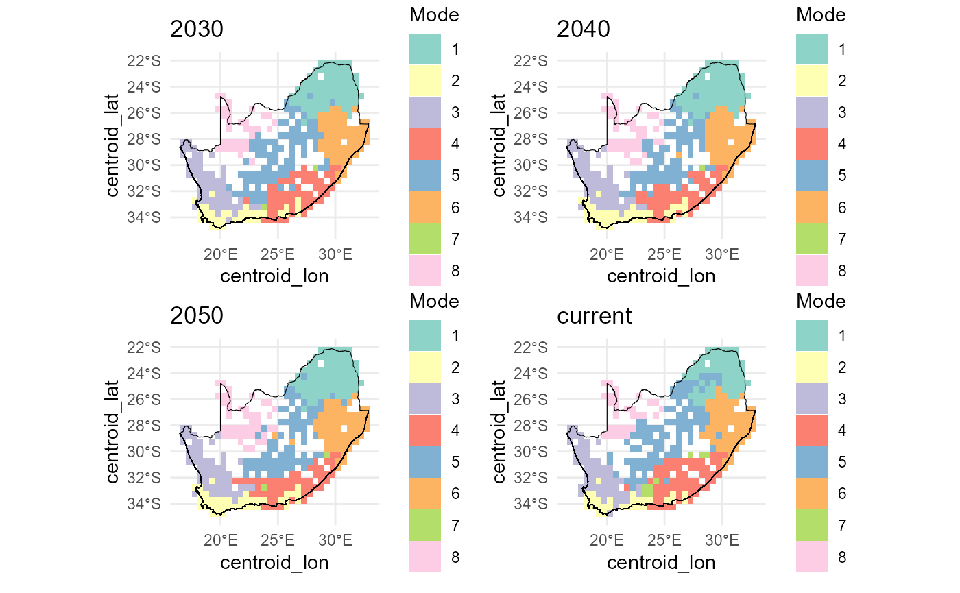
# Check results
str(bioreg_future, max.level=1)
#> List of 6
#>  $ none   :List of 4
#>  $ nn     :List of 4
#>  $ tps    : NULL
#>  $ table  :'data.frame': 1660 obs. of  24 variables:
#>  $ plots  :List of 4
#>  $ methods: chr [1:4] "kmeans" "pam" "hclust" "gmm"
Below we visualise the nearest-neighbour interpolated future‐scenario
cluster outputs. First, we list the structure of the
bioreg_future result to confirm available components. We
then combine the k-means nearest-neighbour rasters for “current” and
each future year into a single SpatRaster stack
(future_nn), and resample, then mask it to the RSA boundary
(mask_future_nn). Finally, we lay out a 2×2 plot grid,
compute a discrete colour palette for each layer based on its unique
classes, and render each masked layer with its boundary overlay for a
quick inspection of bioregion changes across time.
# Check results
str(bioreg_future, max.level=1)
#> List of 6
#>  $ none   :List of 4
#>  $ nn     :List of 4
#>  $ tps    : NULL
#>  $ table  :'data.frame': 1660 obs. of  24 variables:
#>  $ plots  :List of 4
#>  $ methods: chr [1:4] "kmeans" "pam" "hclust" "gmm"

# Create SpatRast
# future_nn = c(bioreg_future$nn$current$kmeans_current,
#              bioreg_future$nn$`2030`$kmeans_2030,
#              bioreg_future$nn$`2040`$kmeans_2040,
#              bioreg_future$nn$`2050`$kmeans_2050)
names(future_nn)
#> [1] "kmeans_current" "kmeans_2030"    "kmeans_2040"    "kmeans_2050"

# 4) Mask `result_bioregDiff` to the RSA boundary
mask_future_nn = terra::mask(resample(future_nn, grid_masked, method = "mod"), grid_masked)

# 5) Quick visual QC in a 2×2 layout
old_par = par(mfrow = c(2, 2), mar = c(1, 1, 1, 5))
titles = c("Current",
            "2030",
            "2040",
            "2050")

for (i in 1:4) {
  ## 1. how many distinct classes in this layer?
  cls  = sort(unique(values(mask_future_nn[[i]])))
  cls  = cls[!is.na(cls)]
  n    = length(cls)

  ## 2. build a discrete palette of n colours
  pal = if (n <= 12) {
           RColorBrewer::brewer.pal(n, "Set3")                      # native Set3
         } else {
           colorRampPalette(brewer.pal(12, "Set3"))(n) # extended Set3
         }

  ## 3. plot
  plot(mask_future_nn[[i]],
       col      = pal,
       type     = "classes",          # treats values as categories
       colNA    = NA,
       axes     = FALSE,
       legend   = TRUE,
       main     = titles[i],
       cex.main = 0.8)

  plot(terra::vect(rsa), add = TRUE, border = "black", lwd = .4)
}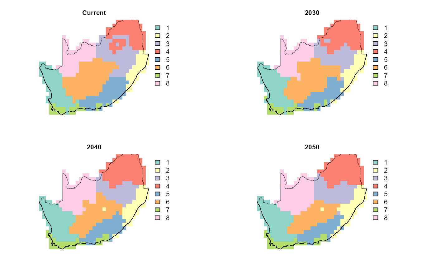
par(old_par)This end-to-end workflow shows how predicted turnover patterns and resulting bioregions might shift as climate warms and rainfall changes, highlighting potential future reorganization of biodiversity hotspots.